9 October 2026
Bespoke Wall Art: How to Create a Piece for Your Room
Plan wall art around your room, taste and budget. Learn what to include in a brief and how a custom art print differs from a handmade commission.
By Ben Gordon
By Ben Gordon · 4 October 2026 · 5 min read
Bring artwork together through colour, subject, frames or spacing. Practical ideas for choosing a pair, adding to an existing print and planning a gallery wall.
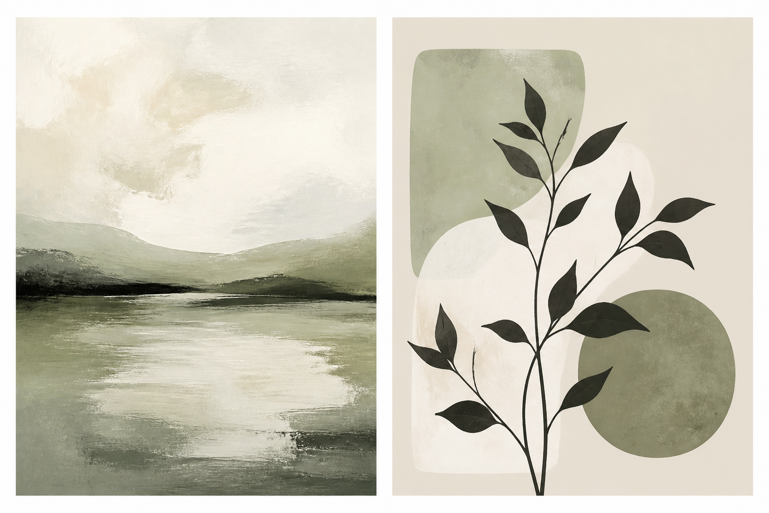
Artwork can work together through a shared colour, a similar style or a consistent frame finish. The pictures do not need to be identical, and they do not need to match every part of the room.
Start by deciding what you are trying to connect: a new print with your furniture, a second piece with an existing favourite, or several pictures on one wall. That will make the choice more manageable.
Look at the colours and materials already present. A rug, cushion or wooden sideboard can give you a starting point. Try repeating one small accent in the artwork, or choose a frame that relates to the furniture.
You can also introduce something new. In a neutral room, a colourful print can become the focal point. In a room with patterned fabrics and open shelves, a simpler image can give the eye a quieter place to rest.
Check the work in the light you normally use. A colour that looks soft in daylight may appear different under warm evening lamps. Room photographs are useful references, but screen previews cannot show exactly how printed colours will look in every light.
When comparing two or more prints, try one of these approaches:
| Shared feature | What to look for | An example |
|---|---|---|
| Colour | A small palette repeated across different images | A landscape and an abstract with cream and muted green |
| Subject | Related themes with varied compositions | Two botanical studies of different plants |
| Line or texture | Similar marks or surface effects | Loose charcoal-style drawings with different subjects |
| Frame and mount | Consistent presentation around varied artwork | Photographs and illustrations in slim black frames |
You can combine these approaches. The point is to give the pieces a visible relationship without making every decision identical.
Begin with what you like about the original. Is it the soft palette, the broad shapes, the subject or the frame? Keep one or two of those qualities in the new piece.
For example, a blue coastal landscape could sit beside an abstract with a similar blue and cream palette. A botanical print might pair with another plant illustration at a similar scale. Compare how much attention each picture attracts: one can lead while the other supports it.
If you are using Create Prints, describe that relationship in the brief. “A companion to a muted coastal landscape, with similar colours but a different composition” gives a clearer direction than “make a matching print”. You can use a suitable reference image for visual guidance where you have permission to do so.
Measure the full outside width and height of the group. Count the frames, mounts and gaps, rather than adding only the paper sizes.
For a pair of similar frames, begin with a modest, even gap and compare the result on the wall using paper templates. Wider spacing can make the pieces feel more separate; closer spacing can help them read as a pair. Adjust for the size of the frames and the space around them.
A row of equal-sized pictures is easy to organise around aligned top edges or centres. Mixed sizes can use a shared centre line or a planned outer shape. Place the arrangement on the floor before marking the wall.
Above furniture, consider the group in relation to that furniture as well as the wall. Check that the frames clear cushions, lamps and other objects, and use suitable fixings for their weight.
Matching frames are a simple way to connect different subjects. They can be particularly helpful when you want the images to provide the variety.
Mixed frames can work too. You might repeat two finishes, use a similar profile or keep the mounts consistent. Try the combination together before buying every frame. A deliberate mixture can feel more personal than a perfectly uniform row.
A ready-made set is also a valid choice if you like the images. Judge it by the artwork and its fit in your space, rather than whether it was sold together.
Browse the print shop or room collections to compare pieces. If you want new artwork, describe a shared brief with the colours, subjects and shapes you would like to repeat. Review each image individually and as part of the group.
If you already have images from ChatGPT or Midjourney, you can print them through the Create Prints plugin or MCP connection. Check that each file suits its intended size; our printing guide explains what to look for.
No. Colour, line, texture or framing can connect different subjects. Choose a relationship that you can see when the images are placed together.
Compare the grey with the other colours in the room, then try an accent from a rug or cushion. You can choose warm, cool or contrasting artwork according to the effect you prefer; the sofa does not dictate one palette.
Yes. Plan their arrangement with paper templates. A shared frame finish or centre line can help connect different shapes.
Not necessarily. Check each file's pixel dimensions and planned print size. One image may need enlargement while the other does not.
Choose the connection first, compare the artwork together and test the complete layout. Explore the collections or create a companion piece for a print you already love.
Every print is analysed for colour and room fit — or describe your space and we'll make something for it.
9 October 2026
Plan wall art around your room, taste and budget. Learn what to include in a brief and how a custom art print differs from a handmade commission.
By Ben Gordon
25 September 2026
Print a ChatGPT image as a poster or framed print with the Create Prints plugin. Sizes, prices and delivery times for Great Britain and the US.
By Ben Gordon
21 September 2026
Choose bedroom artwork you enjoy unwinding with. Explore colour, subject, scale, reflections and practical placement above a bed or on another wall.
By Ben Gordon