Energetic Wall Art
Energetic prints are the loudest in the collection: warm, highly saturated and visually active. The classifier reaches this group only when high intensity and warmth hold together — a saturated blue is intense but reads as cold and lands in Bold instead. These are one-per-room prints. Their whole value is that they dominate, which is also the reason not to hang two of them in a sightline.
26 prints

Arabic Calligraphy Red Rose
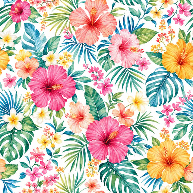
Multicolor Summer Floral Pattern
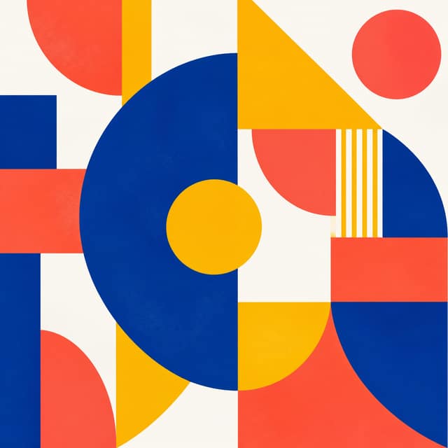
Vibrant Geometric Abstract
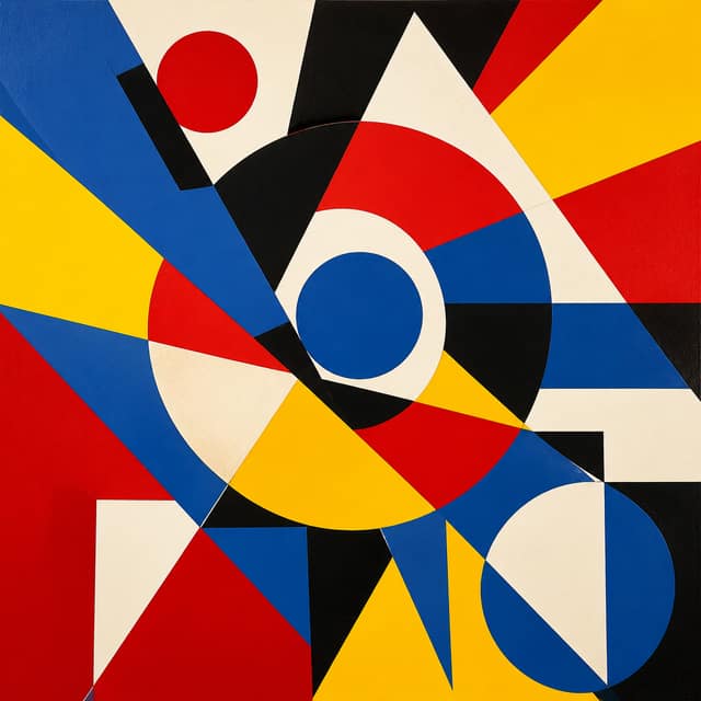
Vibrant Geometric Abstract
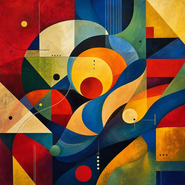
Vibrant Geometric Harmony
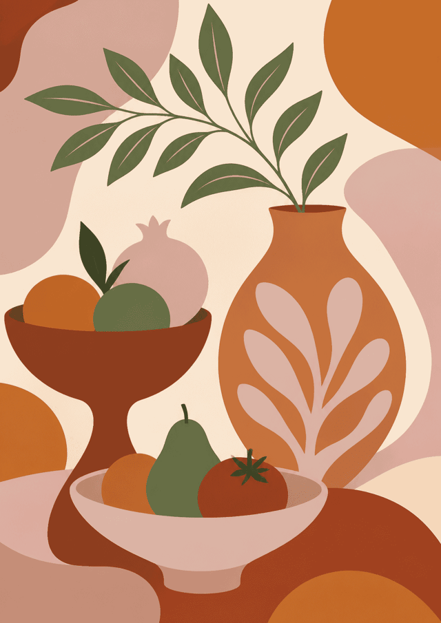
Warm Currents
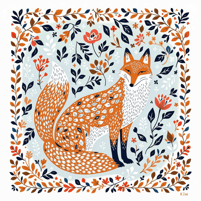
Folklore Fox Reverie
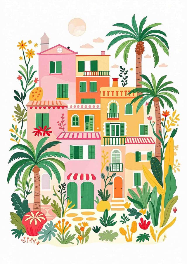
Mediterranean Daydream
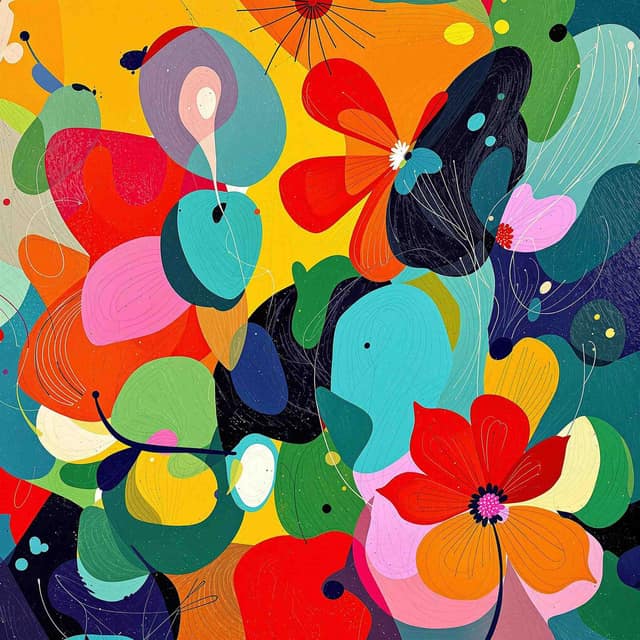
Joyful Whirl of Nature
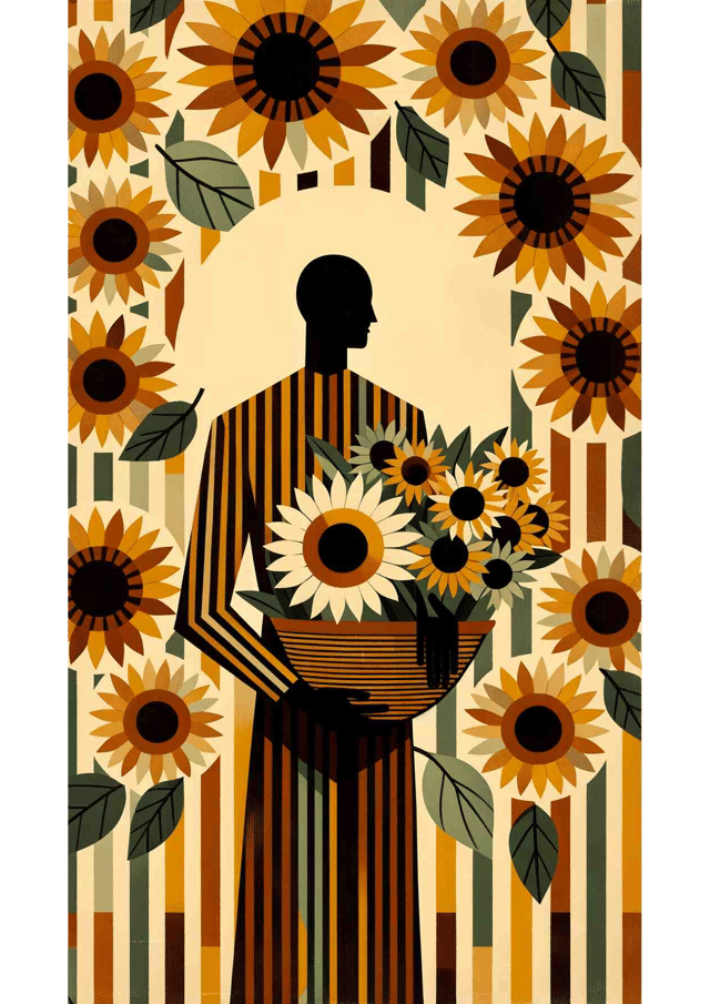
Sunlit Harvest
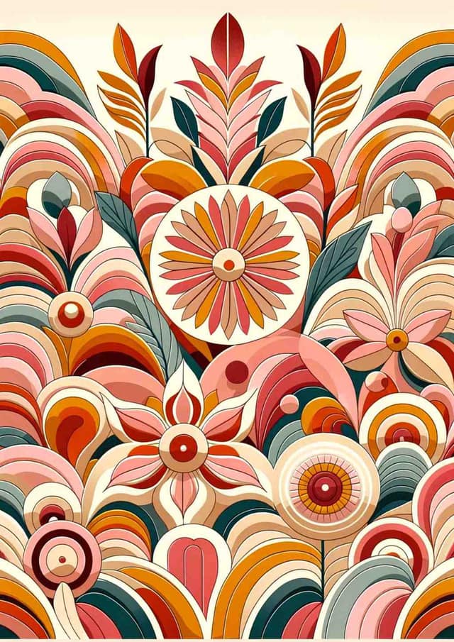
Vibrant Mid-Century Floral Harmony
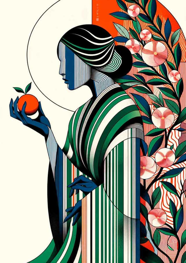
Serenity in Stripes: An Abstract Ode
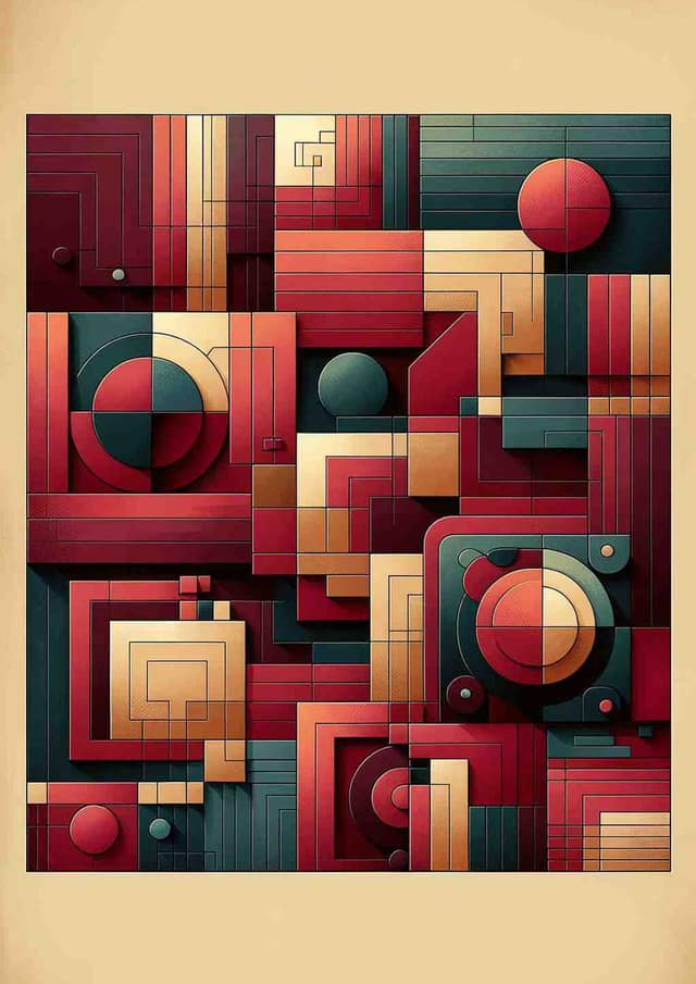
Urban Elegance: Geometric Harmony in Warm Tones
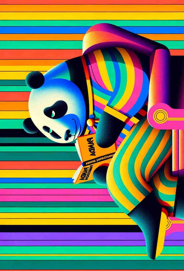
Bear with Panda Pandemonium
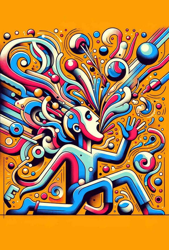
Whimsical Whirlwind
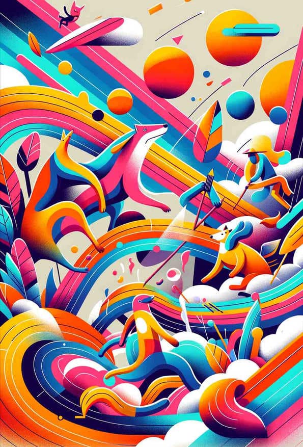
Whimsical Wildlife Carnival
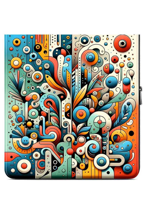
Whimsical Harmony
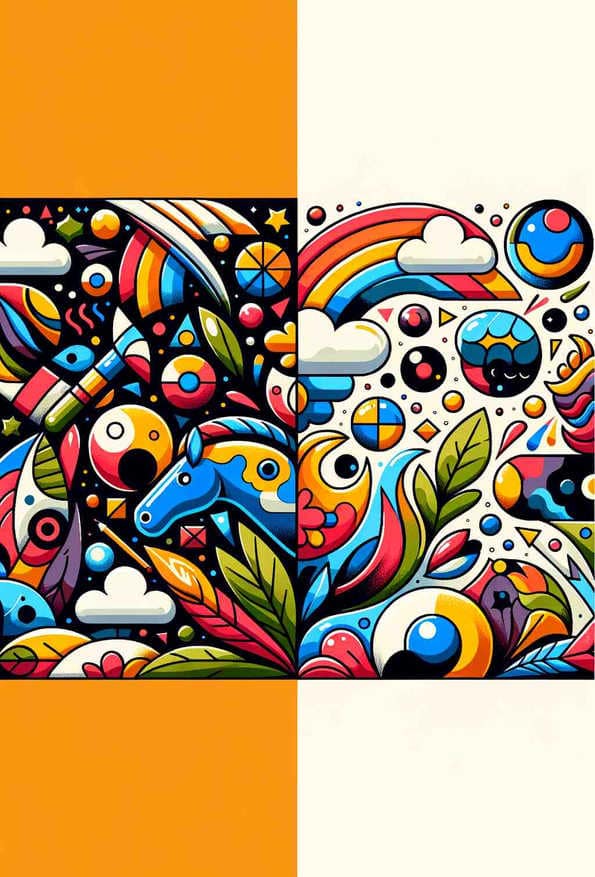
Unified Whimsy: A Modern Harmony
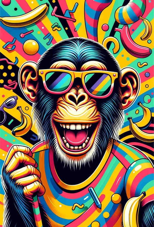
Funky Banana Groove Chimp
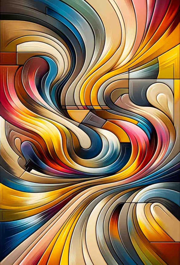
Dynamic Fusion
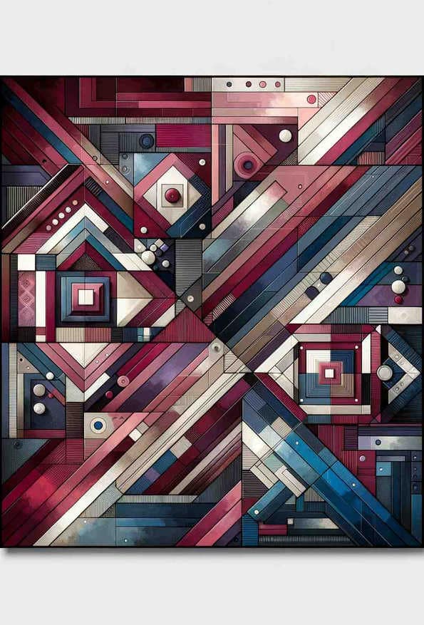
Bold Geometry in Deep Hues
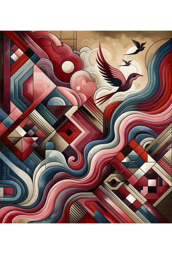
Sunset Serenade in Abstract
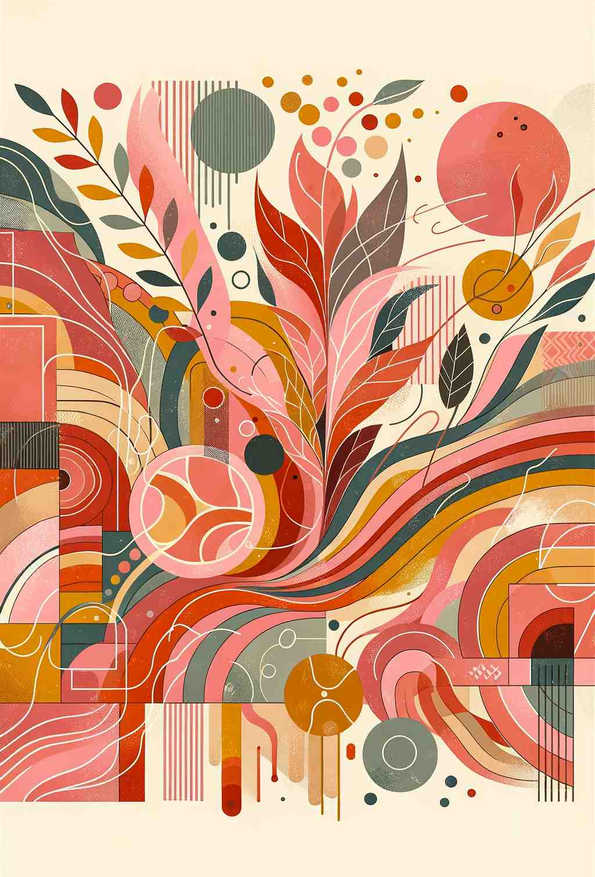
Botanical Vibrance: A Warm Geometric Symphony
Abstract Spectrum
Guide to Choosing Energetic Prints
Best Practices
- Place in active areas
- Combine with complementary pieces
- Use in well-lit spaces
Psychological Effects
- Creates an unambiguous focal point
- Raises the perceived energy of a room
- Suits spaces used briefly and socially rather than for rest
- Best avoided where the room's job is winding down
Scientific Background
The arousal claim on this page is the best-supported one in the taxonomy, because arousal is the dimension colour research measures most consistently. Valdez and Mehrabian found arousal rising with saturation (0.60) and falling with brightness (-0.31) — saturation is the single strongest colour predictor of how activating people find an image. The room advice has a separate basis: environmental-psychology work on interiors finds saturated warm hues engaging the sympathetic nervous system while cool hues engage the parasympathetic, which is a real mechanism rather than a decorating convention, and is why these prints are recommended for kitchens, dining and social rooms and cautioned against in bedrooms. What the evidence does not support is anything more specific — that a particular hue produces a particular emotion. Intensity is measurable; meaning is not.