Wall Art for Living Room — Page 4
The living room is the hardest room in the house to buy art for, because it is the one you look at longest and from furthest away. Most sofas sit two to three metres from the main wall, which quietly rules out prints that depend on fine detail and rewards work with a clear underlying structure. These prints are chosen for that distance: legible at range, with enough tonal depth to stay interesting when you are sitting directly under them. Unique wall art for living room walls is harder to come by than the search results suggest: the large print shops license a design once and then sell that same file to everyone who orders it. Everything here is generated rather than licensed, and printed once the order is placed rather than pulled off a warehouse shelf. If nothing below suits the room, a new piece can be generated to your own brief — including to the colours already in it.
245 prints
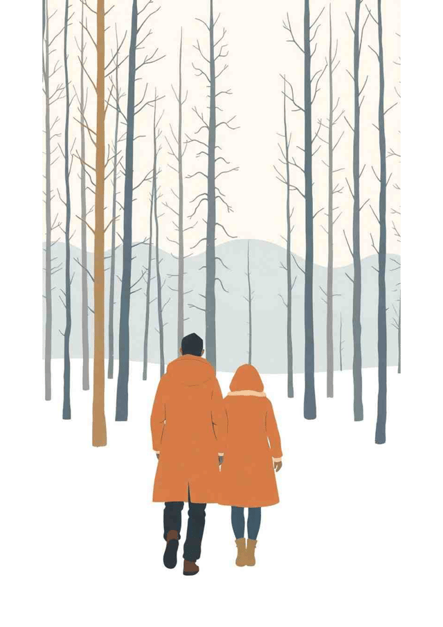
Winter Wanderers
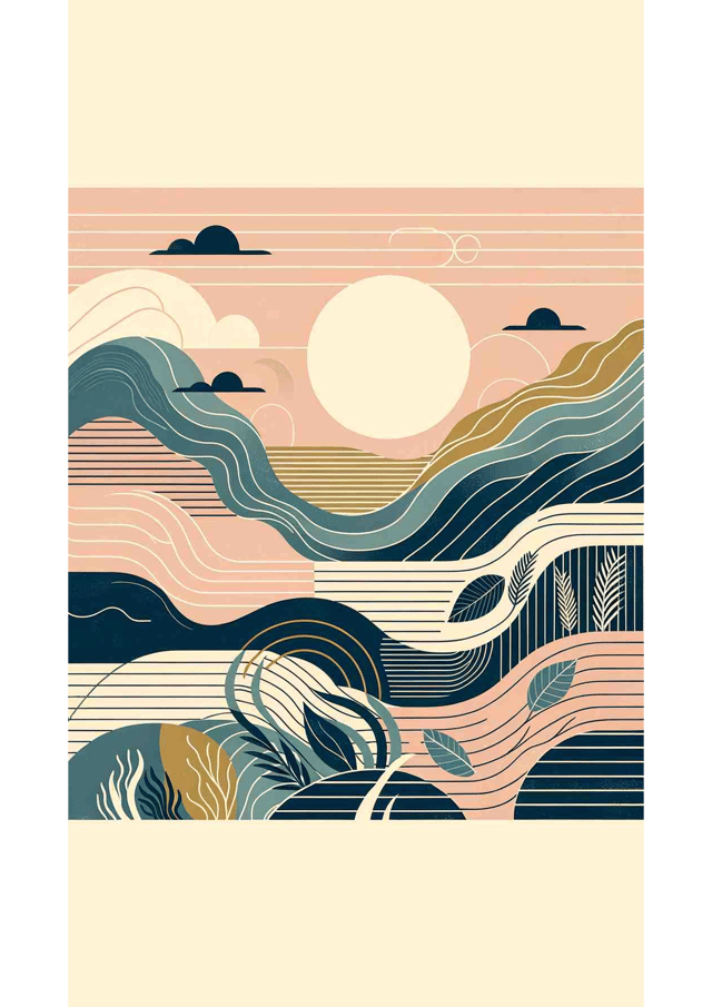
Tranquil Tides
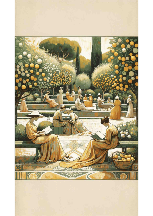
Sunlit Serenity: A Mediterranean Daydream
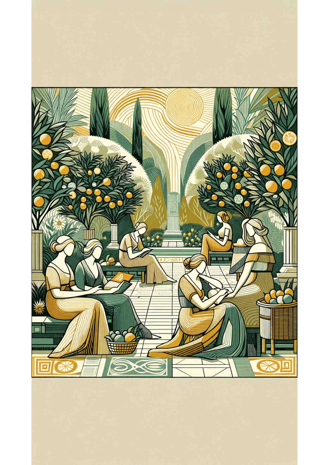
Lemon Grove Reverie
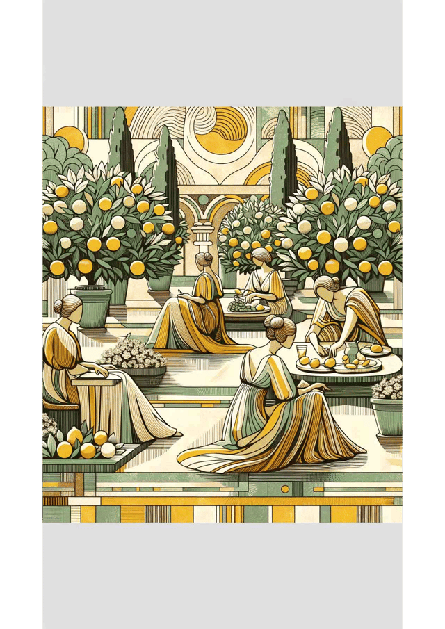
Citrus Serenade
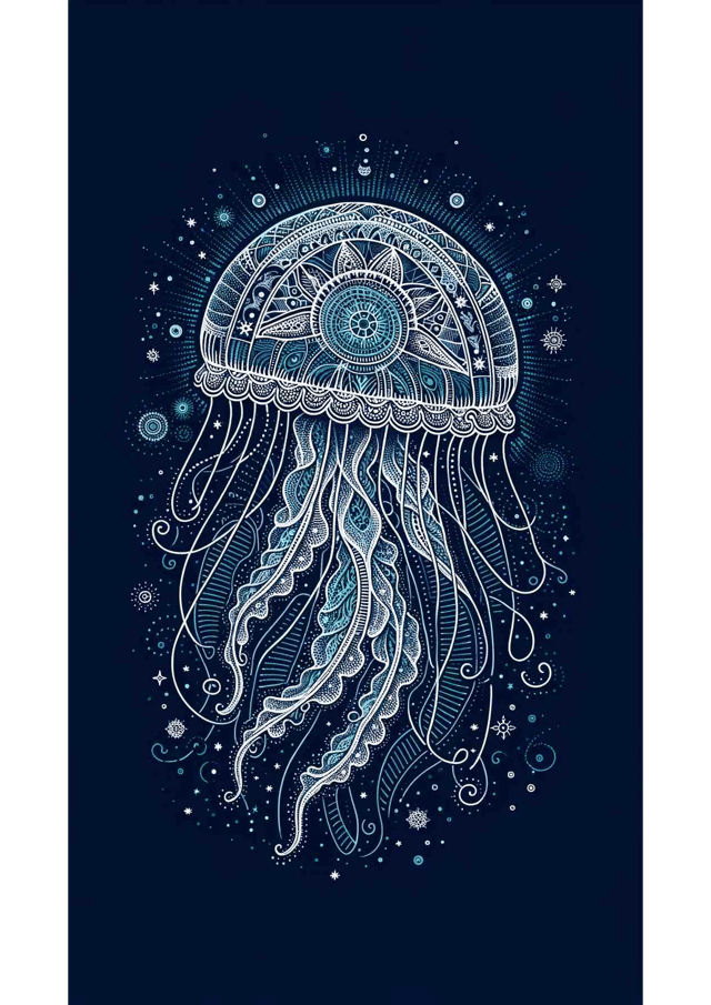
Renaissance Reverie: The Celestial Jellyfish
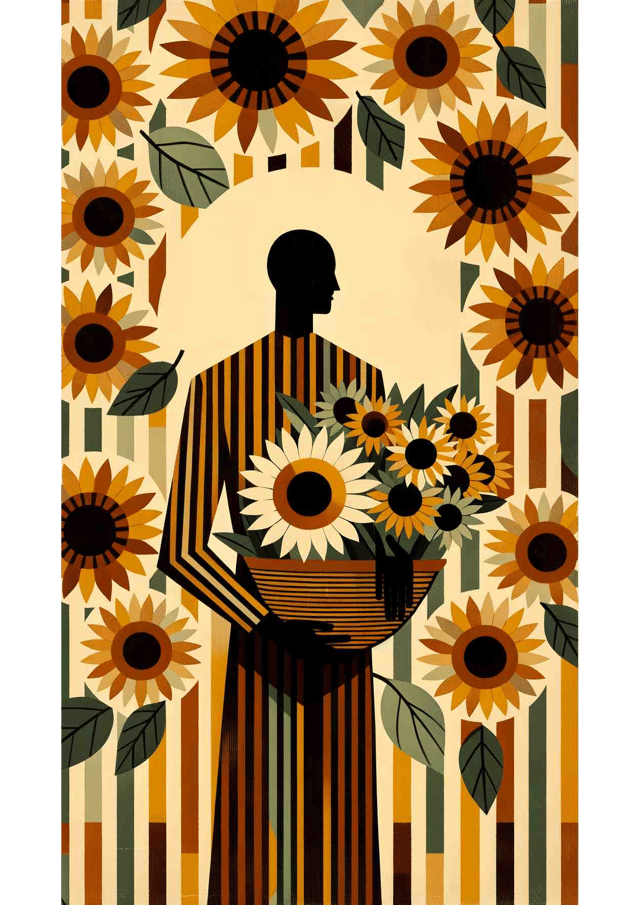
Sunlit Harvest

Ocean Serenity
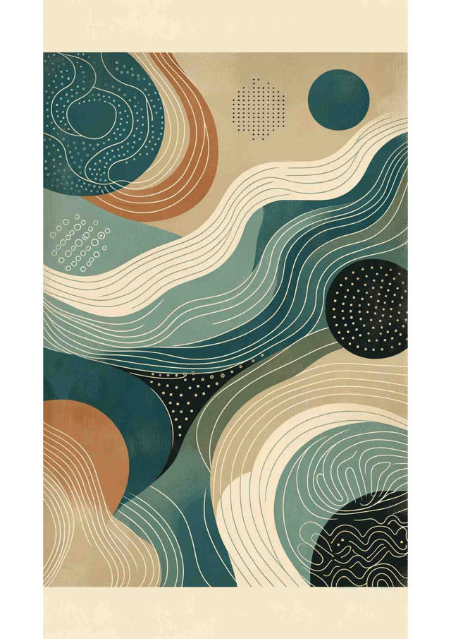
Nordic Serenity
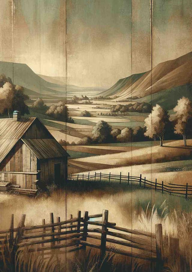
Rustic Reverie
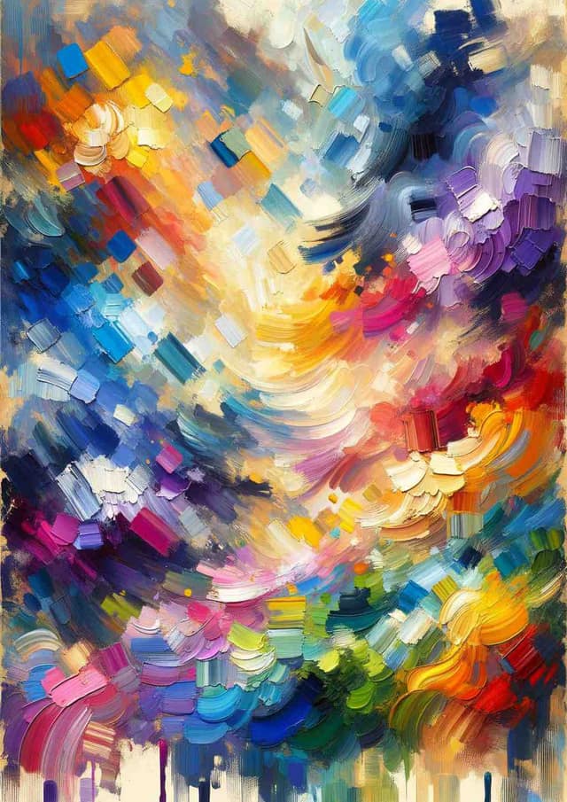
Chromatic Crescendo

Dreamlike Jungle Odyssey
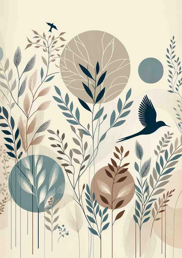
Tranquil Botanic Symphony

Vibrant Mid-Century Floral Harmony
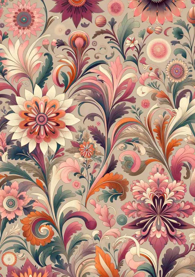
Vibrant 70s Floral Harmony

Vibrant Whirlwind

Moonlit Solitude: A Linocut Canoe Journey

Modern Elegance: Figure with Fruit

Striped Cloak Serenity

Whimsical Foliage Silhouette
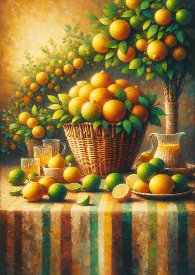
Lemon Grove Picnic: A Modern Impression

Pastel Serenity: Beach Daydream

Pastel Seaside Serenity

Jazzy Dog Delight
Guide to Choosing Art for Your Living Room
Best Practices
- Sizing: Around two thirds the width of the sofa is the usual starting point — for a 200cm three-seater that is roughly a 130-140cm span, either as one piece or as a pair hung to read as one
- Lighting: Mixed daylight and lamplight across the day — prints with a mid-tone base survive that shift better than very pale or very dark ones
- Placement: Hang lower than the gallery standard. The 145cm (57in) centre line assumes a standing viewer; in a room used seated, a 15-25cm gap above the sofa back is the measurement that matters more
- Viewing Distance: At two to three metres, composition and tonal contrast do the work. Fine linework, small text and delicate texture simply disappear
Room Tips
Arrangement Tips
- Anchor to the furniture, not the wall — centre the piece on the sofa even if that leaves it off-centre on the wall
- A pair or trio hung tight, 5-8cm apart, reads as one object and fills a wide wall far more forgivingly than a single undersized print
- Leave the wall beside a television quiet. Two focal points at the same eye level cancel each other out
- Where there is a fireplace, treat that as the primary wall and let the sofa wall take the calmer piece
Style Suggestions
- Abstract
- Landscape
- Tonal photography
- Geometric
- Botanical
Color Recommendations
- Pull one colour from something already in the room — a rug, a cushion, the spines on a shelf — rather than matching the wall paint
- A print a few shades deeper than the sofa reads as deliberate; an exact match reads as an accident
- North-facing rooms take warmer palettes well; a bright south-facing room stays comfortable with cooler tones
Practical Considerations
- Hang perpendicular to a window rather than opposite it — direct sun fades even archival pigment inks over a few years
- Glazed frames throw reflections. With a lamp behind the seating, a matt or unglazed finish is easier to live with
How These Prints Are Made
- Every design in this collection was generated for Create Prints rather than licensed from a stock library, so it is not the same file being sold through a dozen other print shops
- Nothing is warehoused — a print is made on fine art paper after the order is placed, which is why the catalogue can be this large without anything sitting around as surplus stock
- A catalogue print can be ordered by more than one person, and we would rather say so than imply otherwise. If you want an image that exists only on your wall, generate a new one rather than buying from the grid above
- The generator works from a written brief, so a piece can be built around what is already in the room: take the palette from the rug or the curtains and ask for those colours
Scientific Background
The evidence here is real but narrower than most decorating advice implies. Research on restorative environments — Ulrich's work on stress recovery, and the Kaplans' attention restoration theory — consistently finds that views of natural scenes speed physiological recovery from stress, and the effect survives when the view is a picture rather than a window, though more weakly. That supports a modest claim: in a room used for winding down, landscape and natural-form imagery is a defensible default. It does not support the stronger idea that any particular colour reliably produces a particular mood on its own.