Serene Wall Art — Page 2
Serene is the largest group in the collection and the least dramatic, which is usually the point. A print is classified serene when three things hold at once: low saturation, a narrow tonal range, and little fine detail — measured from the image rather than inferred from its colours. Nothing competes for attention, so the eye settles instead of tracking. These are prints for a room you want to feel quieter than it currently does.
79 prints
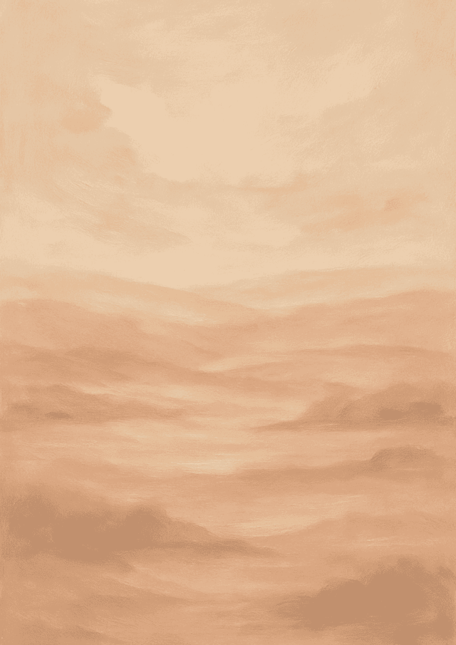
Whispering Horizons
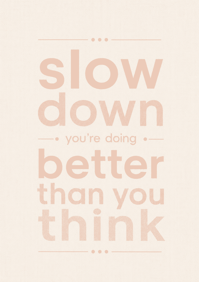
Warm Whispers
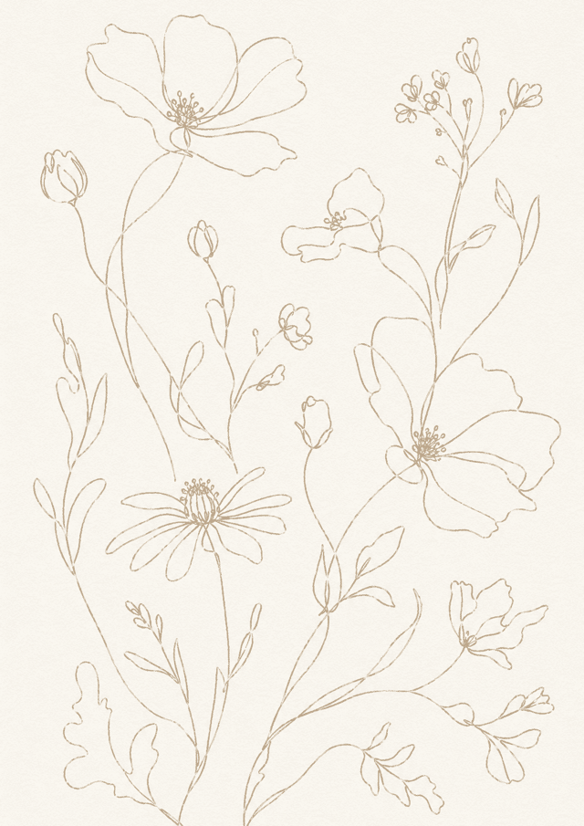
Whispering Wildflower
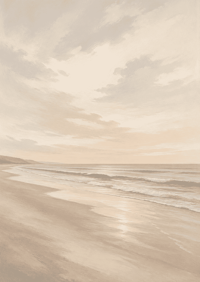
Tranquil Tides
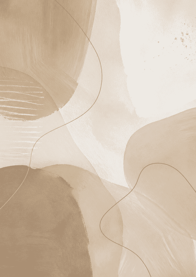
Serene Layers
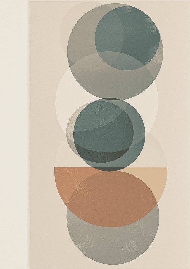
Earthbound Harmony
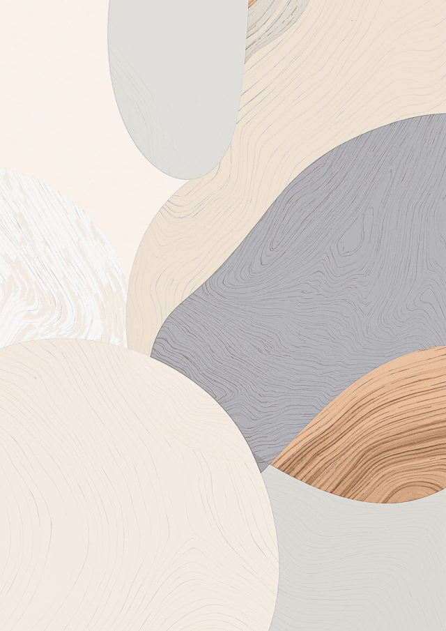
Serene Geometry
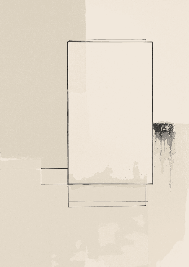
Quiet Geometry
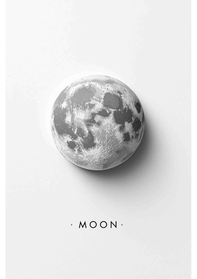
Lunar Elegance
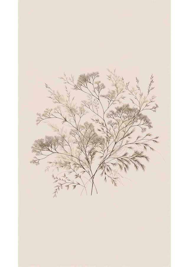
Whispering Elegance
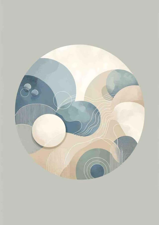
Nordic Serenity
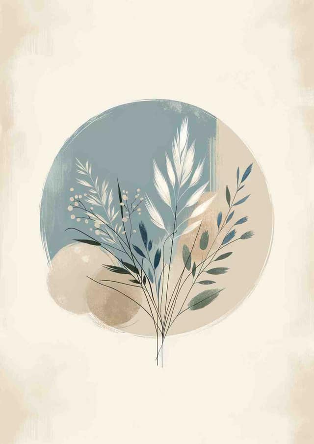
Serene Botanical Minimalism
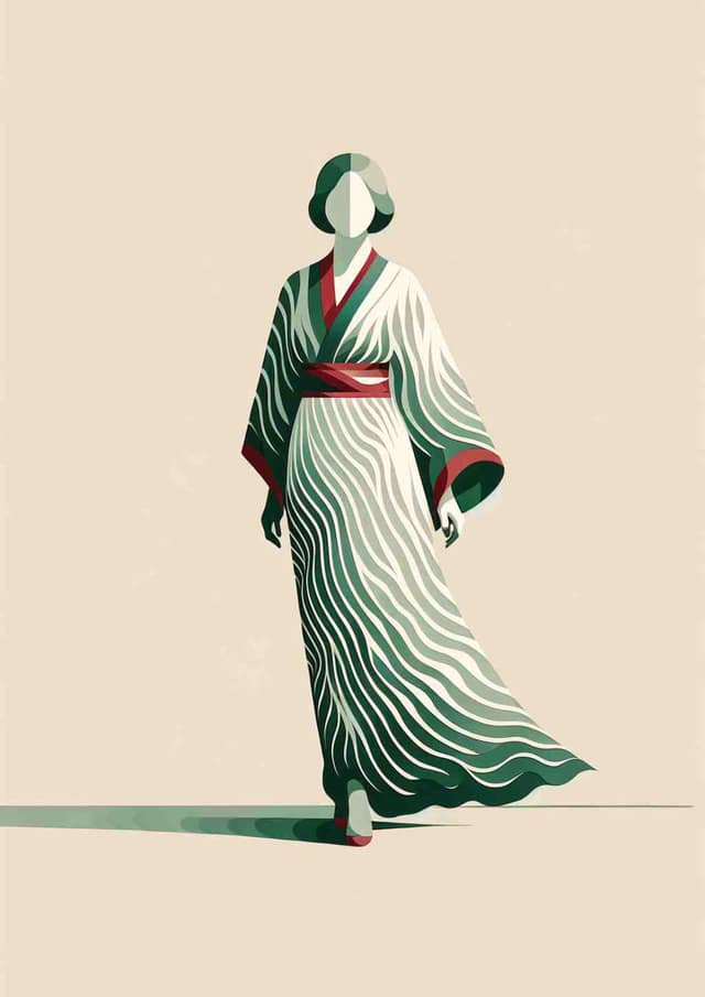
Stylized Serenity: Minimalist Elegance
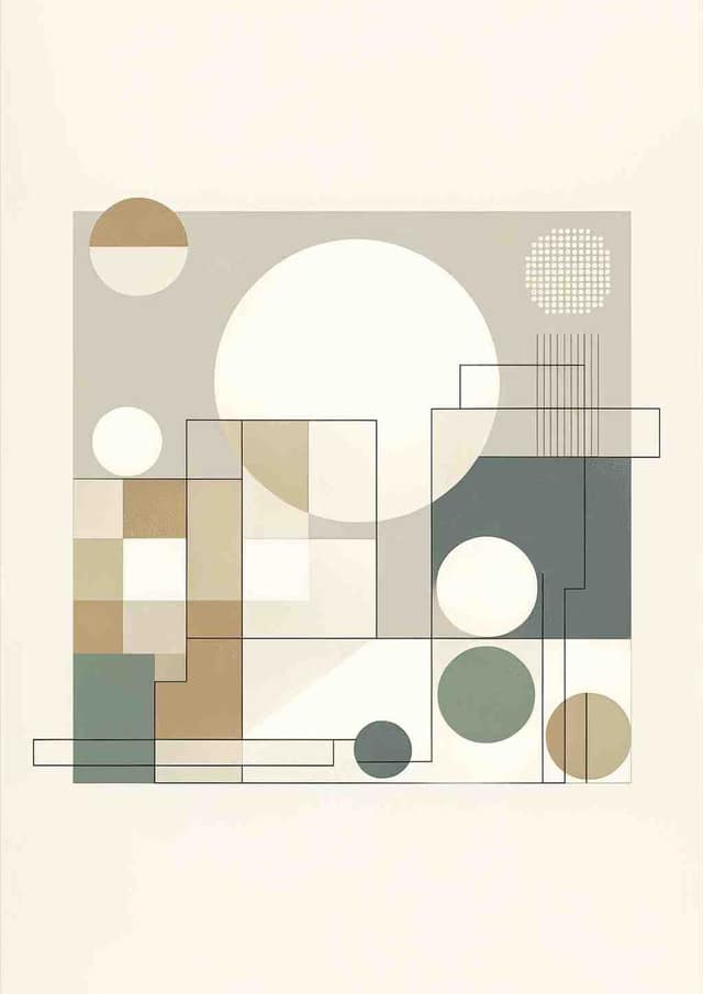
Minimalist Serenity
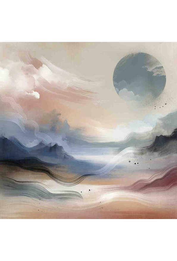
Serene Symphony
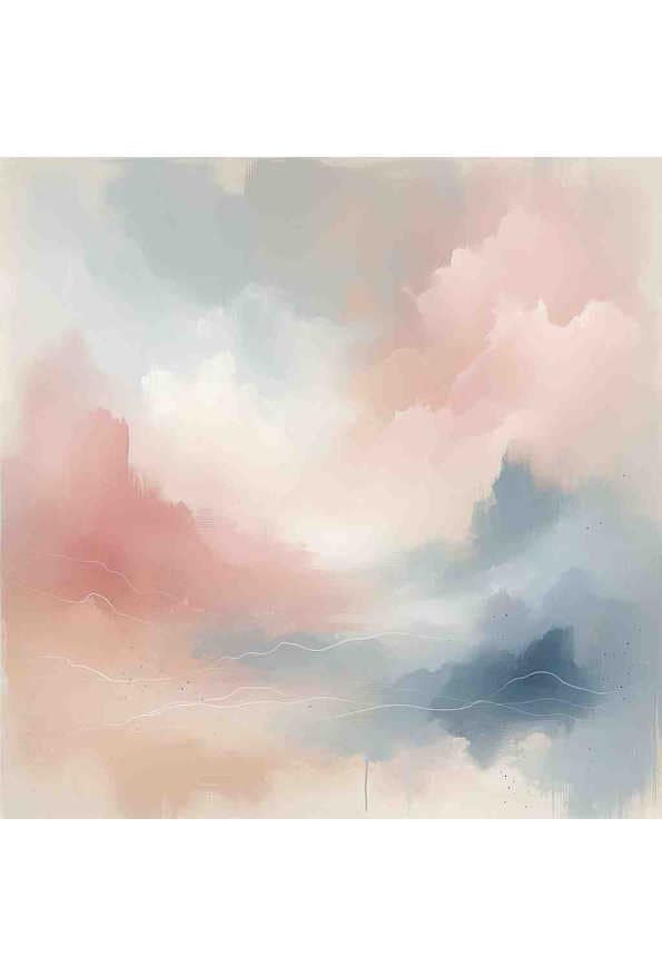
Serene Spectrum
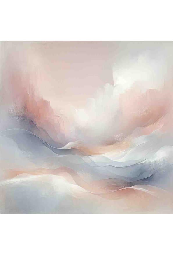
Whispers of Serenity
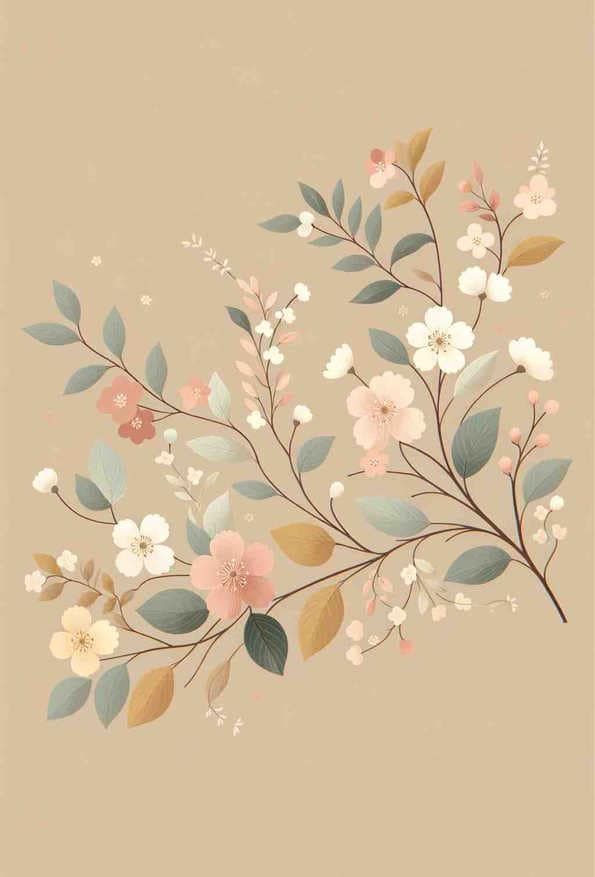
Pastel Blossoms on Beige Background
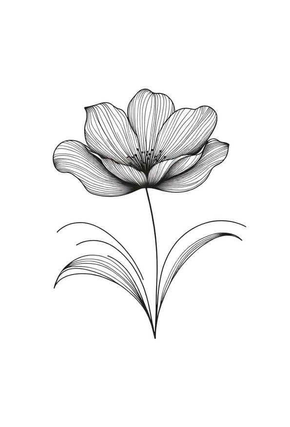
Minimalist Tulip in Line Art
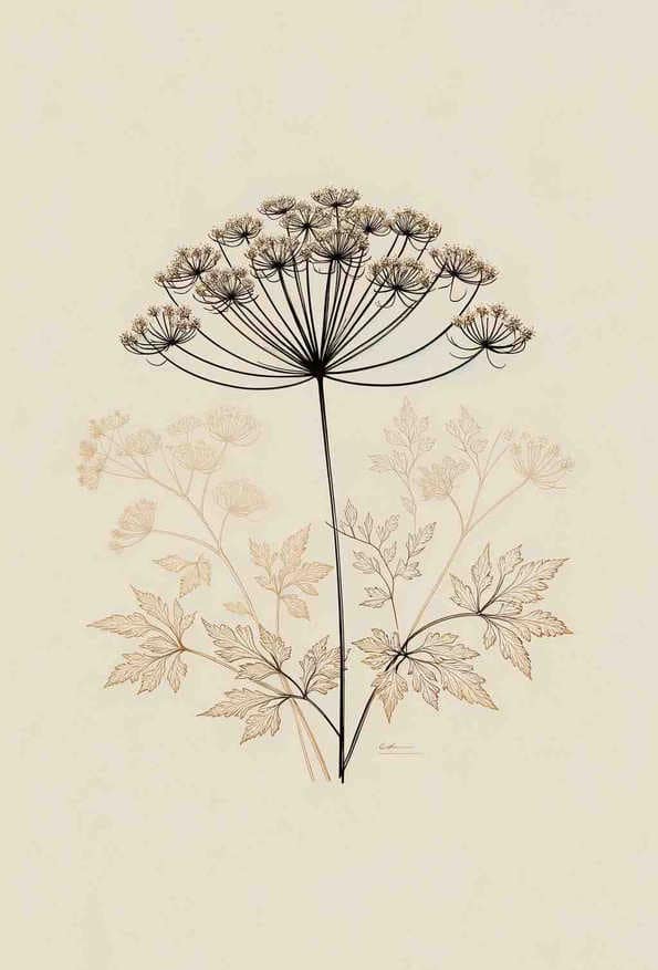
Elegant French Botanical: Cow Parsley Delight
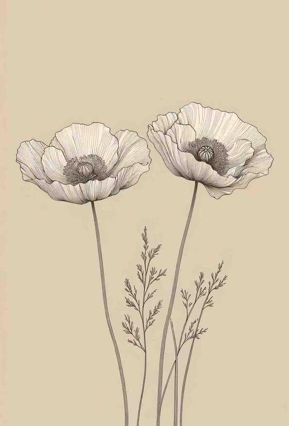
Botanical Ballet in Line Art
Tranquil Geometric Harmony
Whimsical Dandelion in the Breeze
Tranquil Harmony
Guide to Choosing Serene Prints
Best Practices
- Best where lowering the visual noise is the actual job: bedrooms, bathrooms, reading corners and rooms that are already busy with pattern or texture
- Serene work rewards scale. A large calm piece holds a wall; a small one on the same wall just looks lost
- Hang in a series — low-contrast prints gain from repetition in a way bold pieces do not
- Give them a plain wall. Patterned wallpaper cancels a narrow tonal range almost entirely
- Check the print under evening lamplight before committing. Pale, low-contrast work loses the most when daylight goes
Room Tips
Pairing
Serene work is the natural partner to a single bold piece elsewhere in the same sightline. The contrast makes both read more clearly than either does alone.
Best Rooms
- Bedroom, where low arousal is the point
- Bathroom, where the surfaces are already visually busy
- Nursery, where sleep matters more than stimulation
- Reading corners and snugs
- Home office, when the work is focused rather than creative
What To Avoid
A whole house of serene prints reads as underfurnished rather than calm. The effect depends on something louder existing somewhere.
Psychological Effects
- Lowers the visual arousal of a room
- Supports rest and sustained focus
- Makes a small or cluttered room feel less crowded
- Recedes behind furniture and textiles rather than competing with them
Scientific Background
Colour psychology is routinely oversold, so it is worth being precise about what holds up. The most replicated finding is not about hue at all: across studies of colour and emotion, saturation and brightness predict how arousing people find an image far more reliably than whether it is blue, green or grey. Valdez and Mehrabian found arousal rising with saturation and darkness — a vivid blue is not calming, a muted one generally is. That is why this collection is defined by saturation and tonal range rather than by colour. Visual complexity is the third axis, and it is an arousal driver in its own right: Berlyne grouped it with novelty and surprise as a "collative variable", and edge density is the standard way to measure it (Donderi's review of visual complexity; Nadal and colleagues on complexity in artwork). A dense drawing and a flat wash can share a palette entirely, so this collection measures the detail in each image rather than guessing at it from the colours. Neither result promises a print will change how you feel. Both suggest the same practical rule: what settles a room is restraint in saturation, contrast and detail, not the choice of colour.