Uplifting Emotional Wall Art Prints
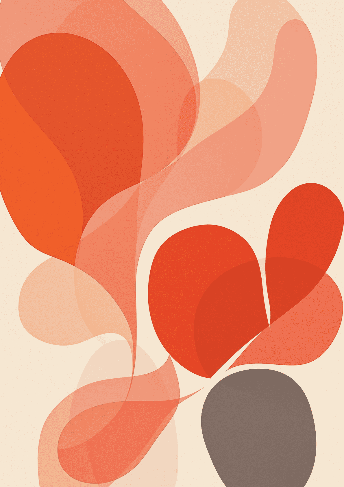
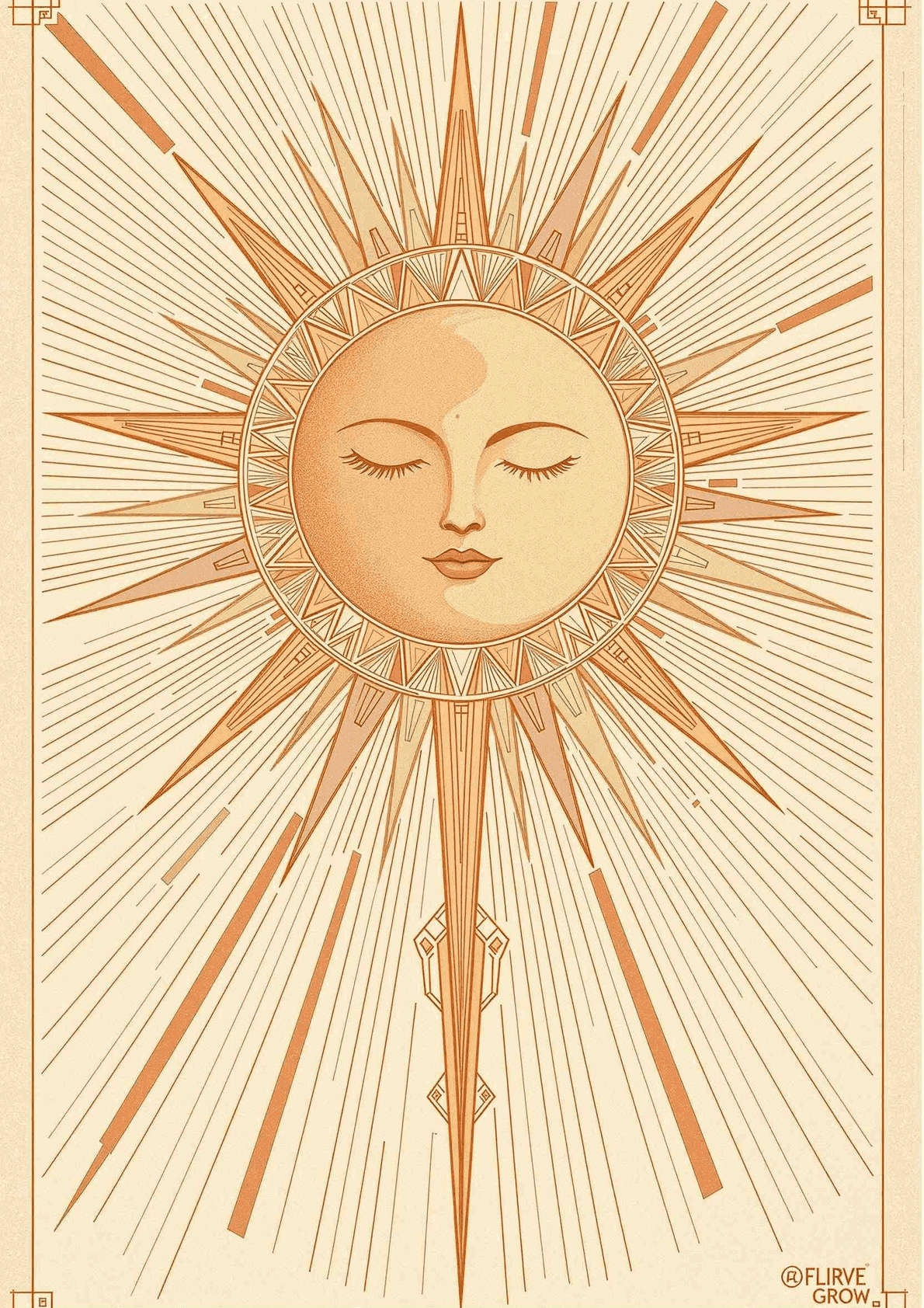
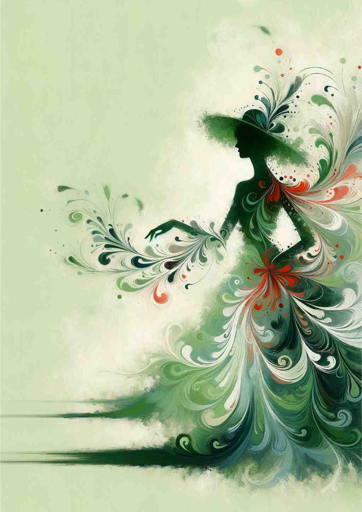
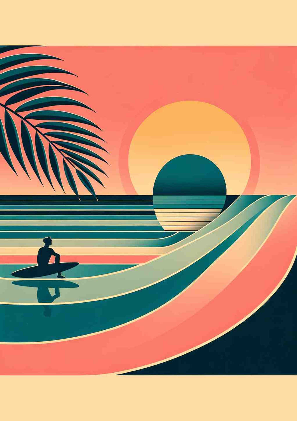
Uplifting prints are bright and good-humoured without tipping into loud. The classifier places work here on high pleasantness with only moderate intensity — light, positive colour that has some lift to it but stops short of the saturation and contrast that would make it a statement piece. These are the prints that make a room feel cheerful rather than energised, which is a useful distinction when the room is one you sit in.

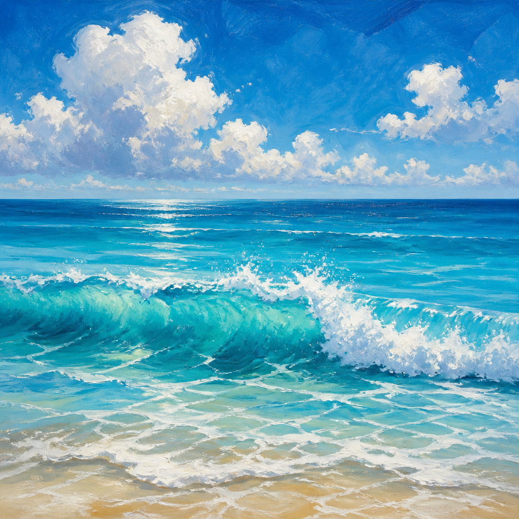
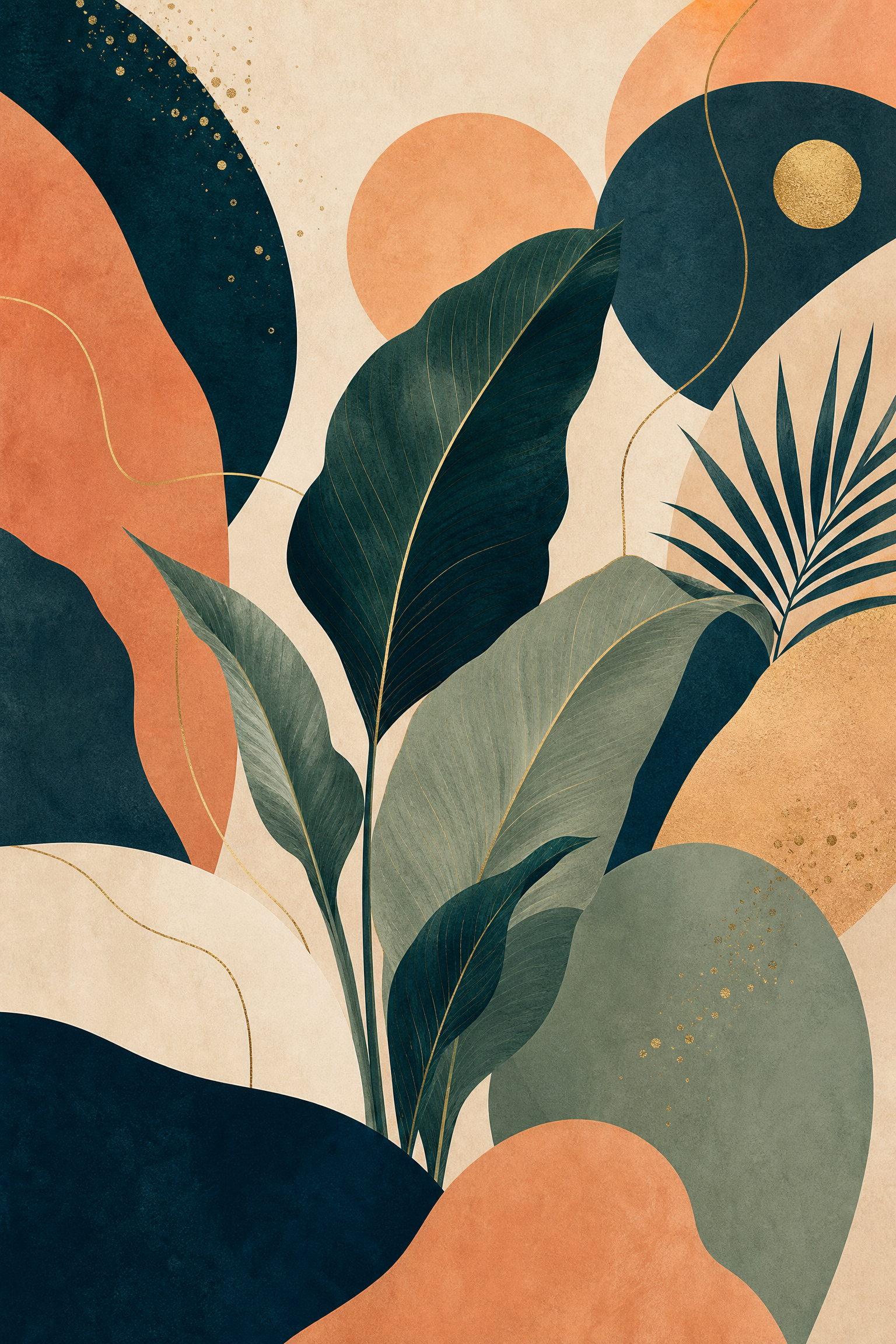
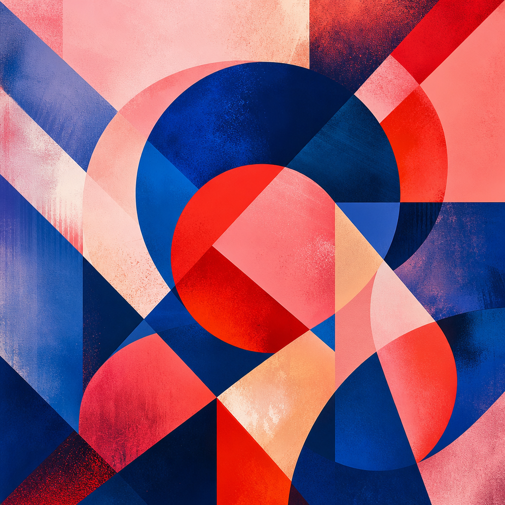
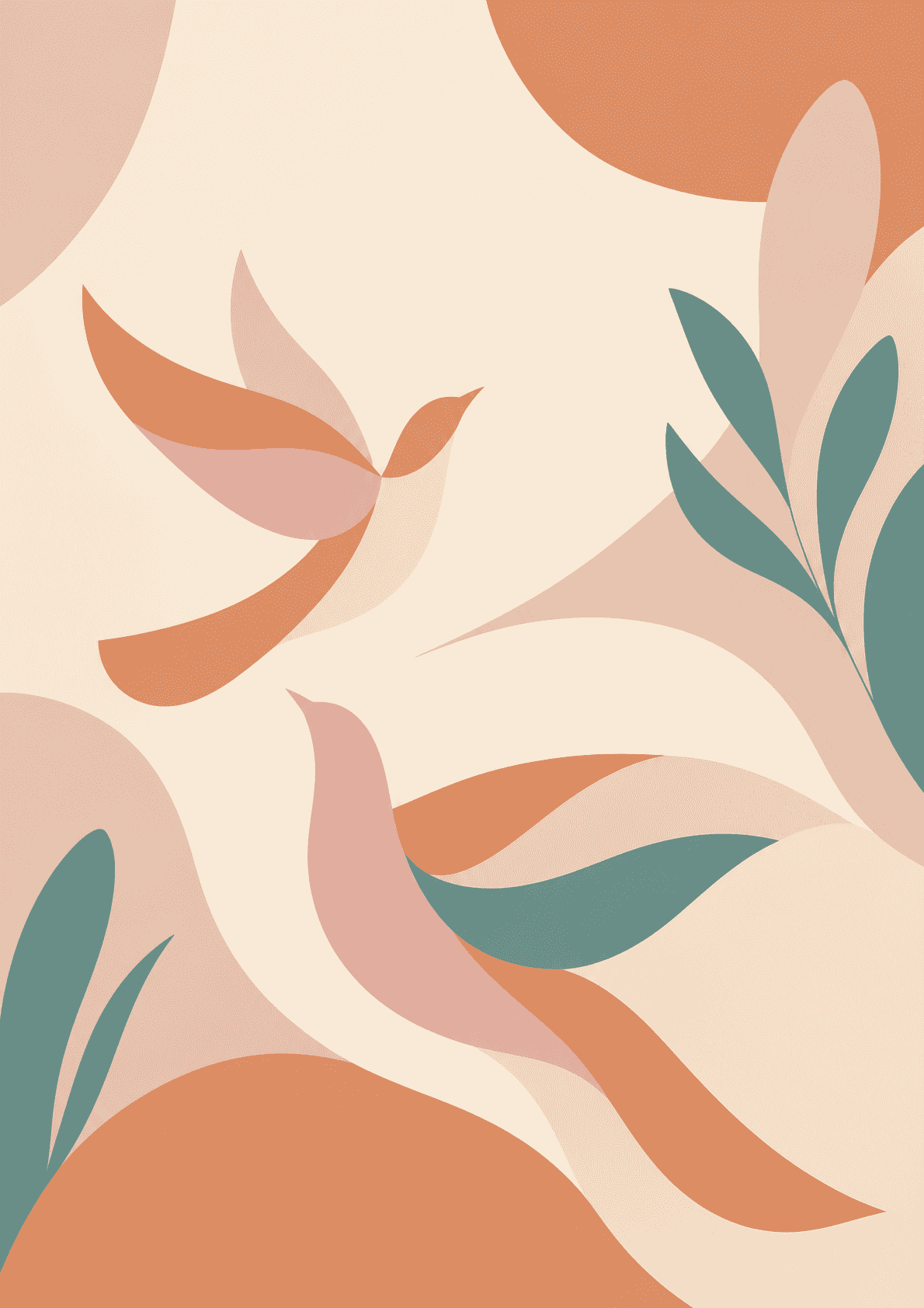
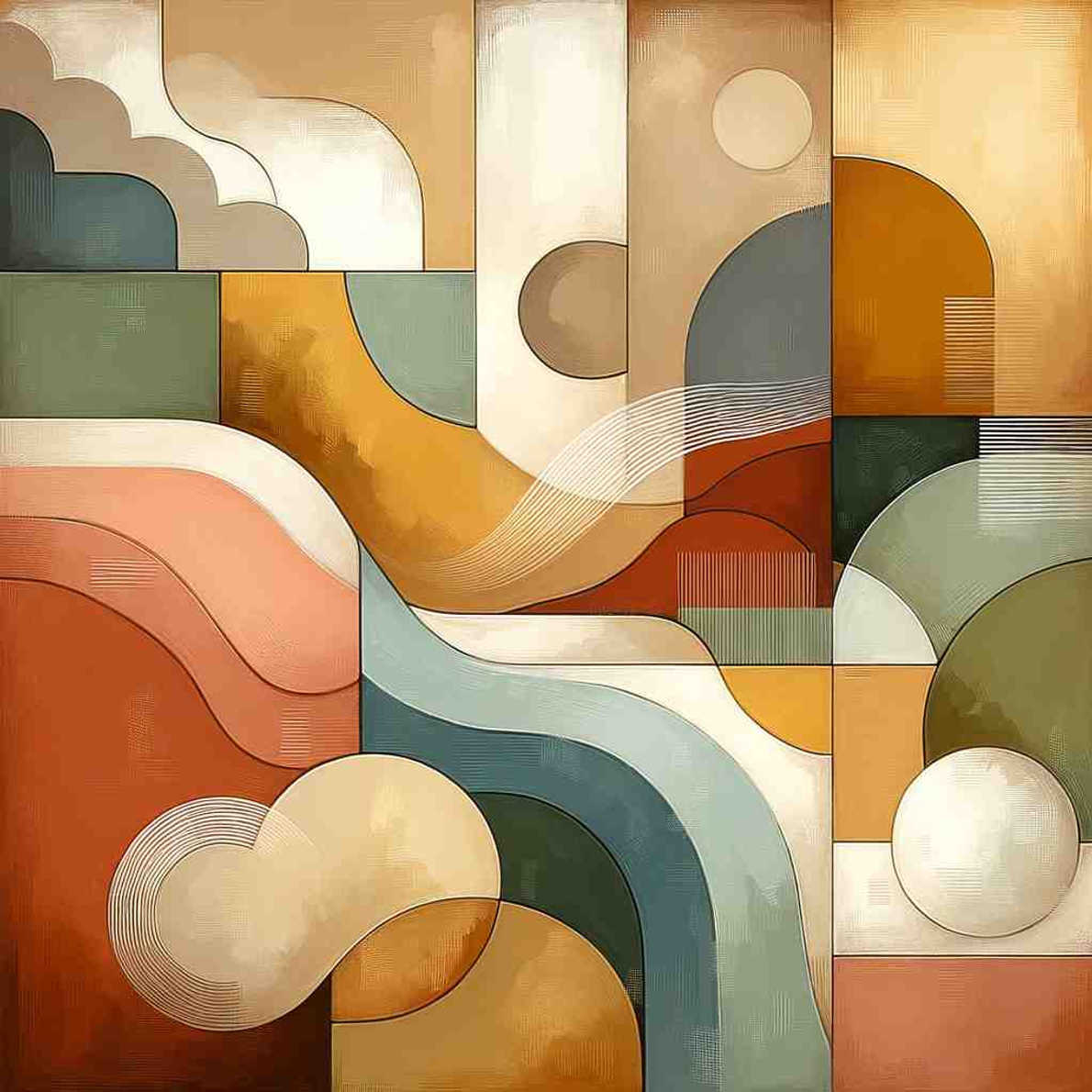

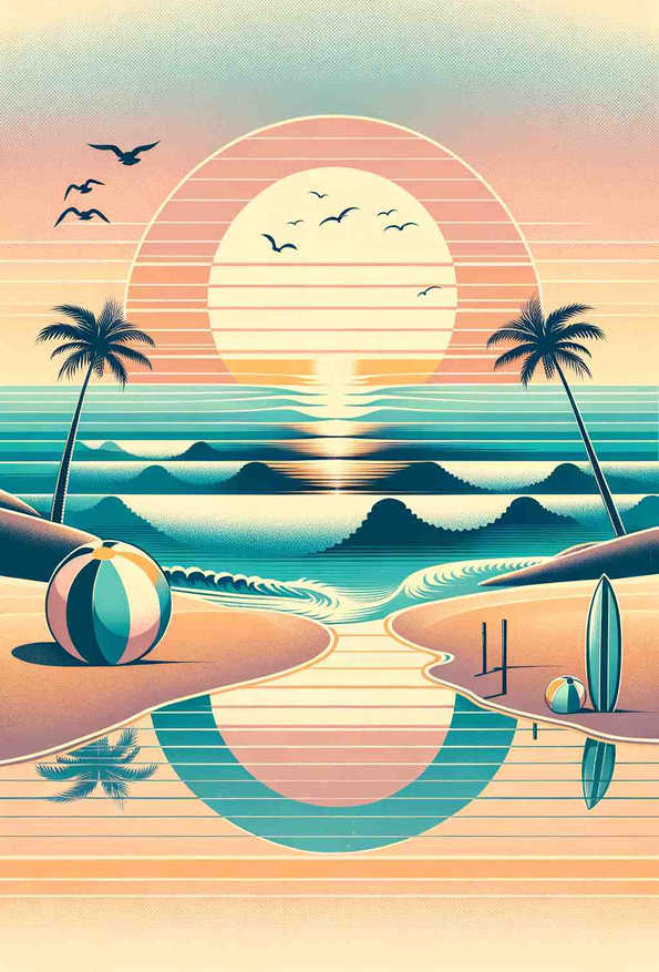
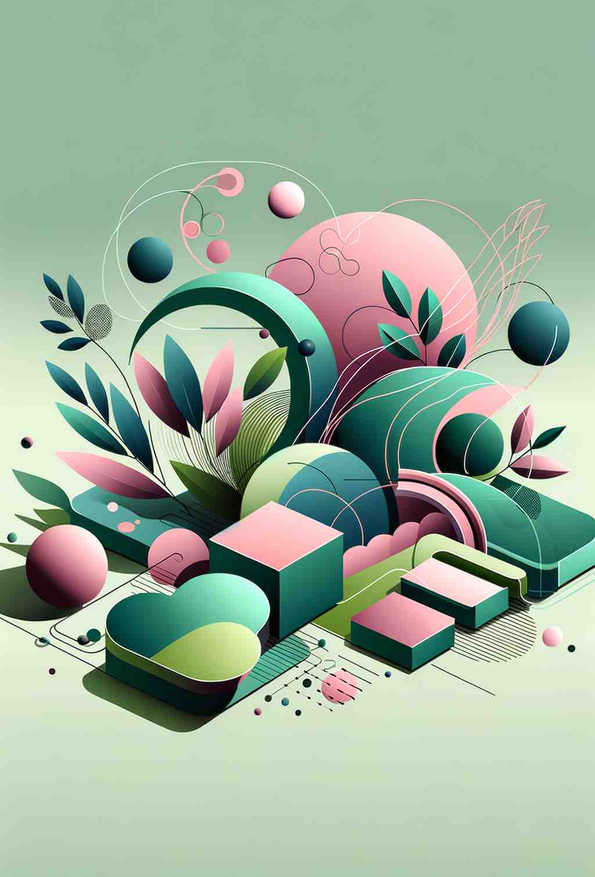
Guide to Choosing Uplifting Prints
Psychological Effects
- Lifts a room that reads as flat or cold
- Reads as welcoming in shared and entrance spaces
- Bright without the visual noise of a high-contrast piece
- Works where a bolder print would be too much for daily viewing
Scientific Background
This group is defined on the pleasure axis rather than the arousal one, and the distinction matters. Valdez and Mehrabian's regression of the pleasure-arousal-dominance model onto colour found pleasure driven mainly by brightness (0.69) with saturation contributing far less (0.22), while arousal ran the other way — up with saturation, down with brightness. Bright and lightly-coloured work therefore scores high on pleasantness while staying low on arousal, which is exactly the combination this collection selects for. The claim is deliberately modest: this is what people reliably rate as pleasant, not a promise about mood. A more recent finding is worth stating alongside it — a 2025 study using text-to-image models across 21 subjects found emotion arising from combinations of hue, chroma and lightness rather than from single colours, and found no reliable blue-sadness link once chroma and lightness were controlled. Single-colour folk associations do not survive contact with the evidence.