Balanced Wall Art — Page 2
Balanced is the honest residual of the collection: prints that meet the criteria for none of the other traits. Not calm enough to be serene, not warm enough to be grounded, not dense enough to be intricate, not loud enough to be bold. That sounds like faint praise and mostly is not — a print with no single dominant quality is the one that causes the fewest problems on a wall you have not finished decorating, and it is the safest choice when you are buying before the room is settled.
75 prints
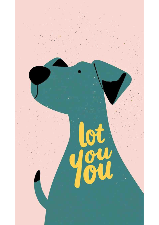
Woof Wave
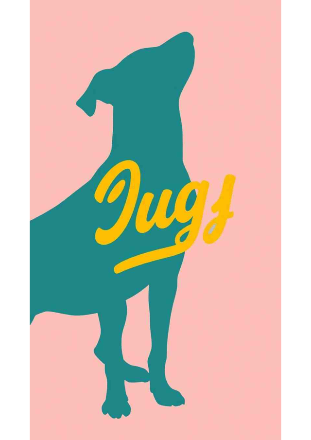
Woof in Teal and Mustard
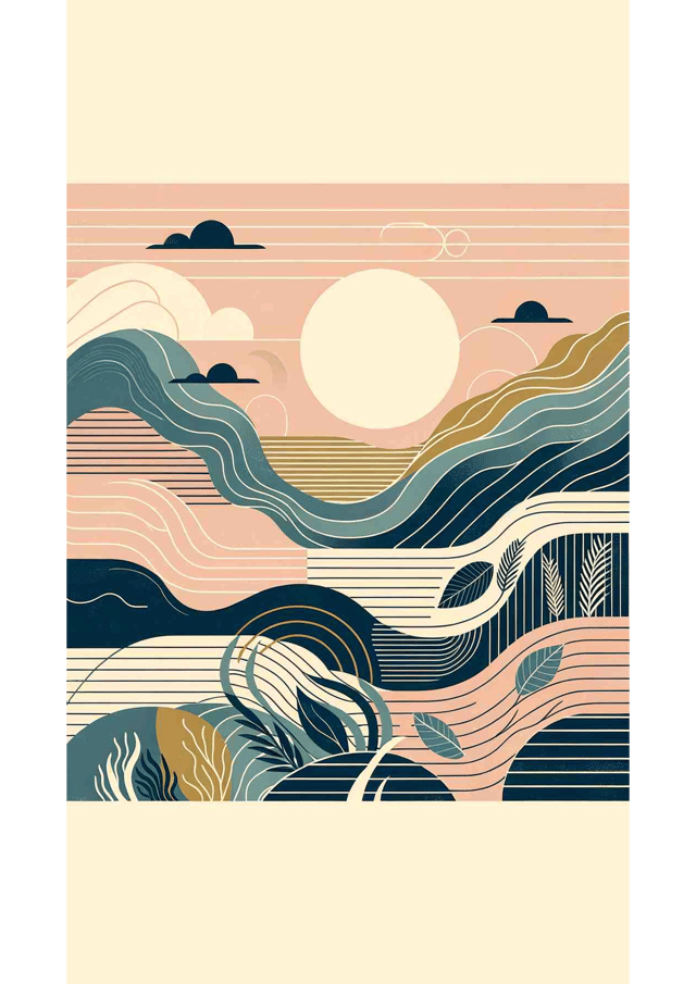
Tranquil Tides
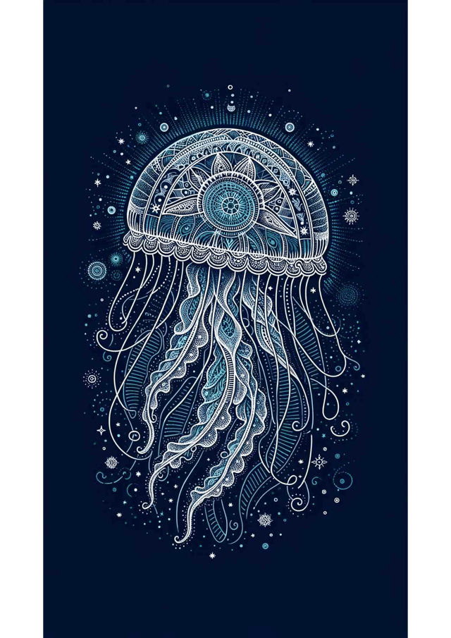
Renaissance Reverie: The Celestial Jellyfish
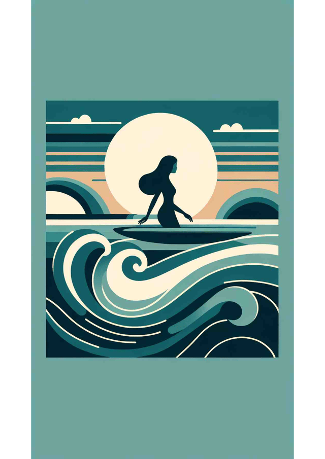
Ocean Serenity
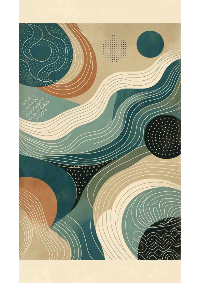
Nordic Serenity
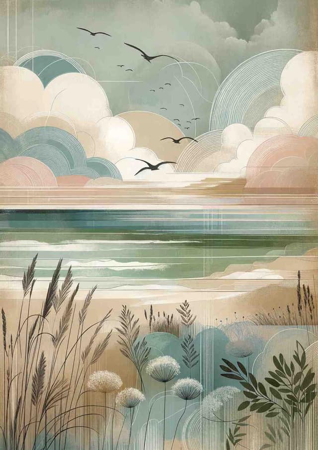
Whispers of the Coastline
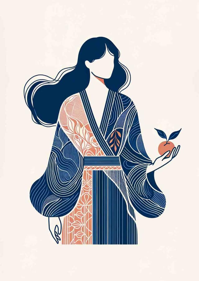
Modern Elegance: Figure with Fruit
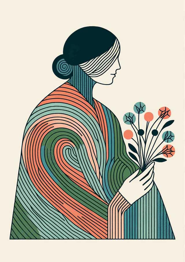
Striped Cloak Serenity
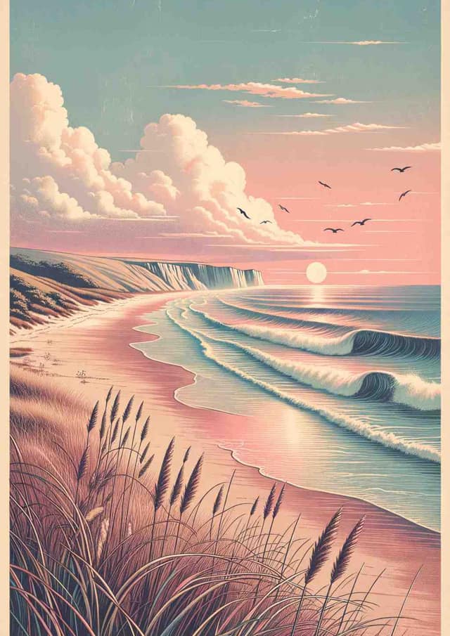
Nostalgic Sunrise: A Coastal Reverie
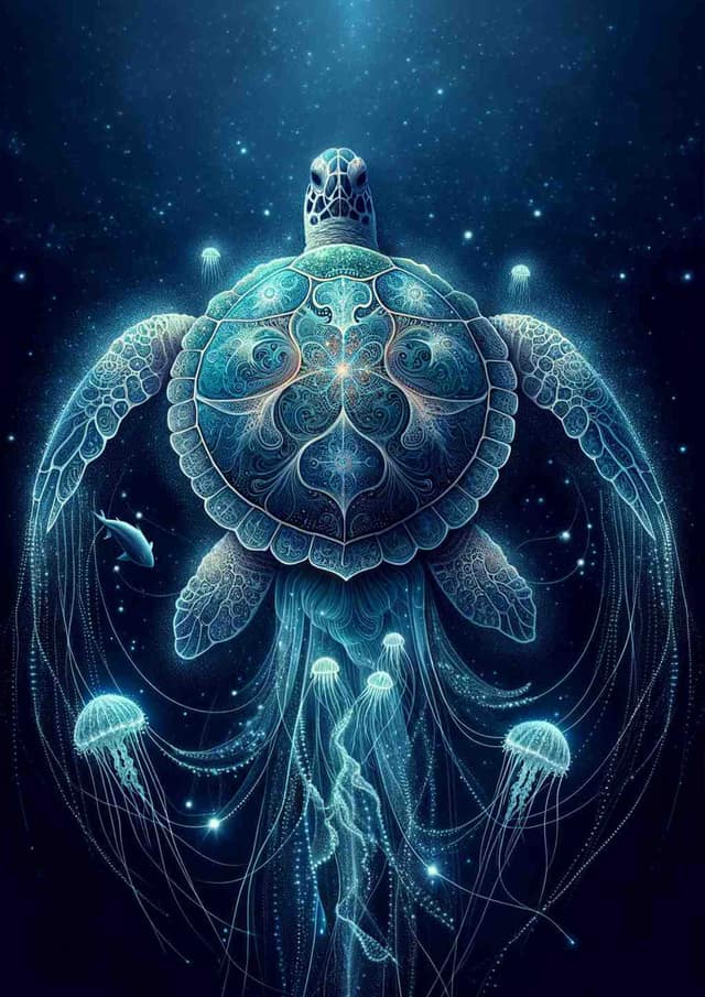
Bioluminescent Turtle Reverie
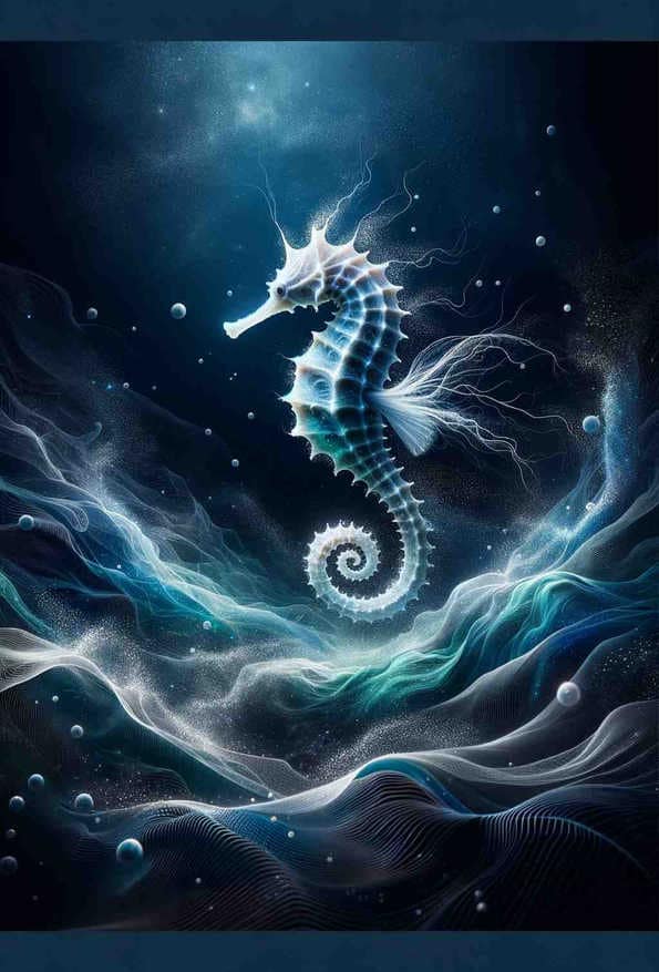
Celestial Seahorse Serenade
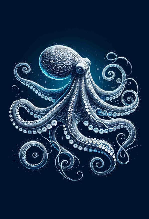
Cosmic Serenity: The Starry Octopus
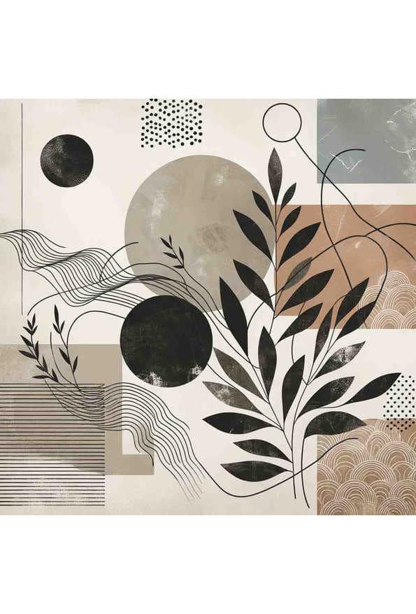
Tranquil Elegance: A Modern Organic Minimalist Art
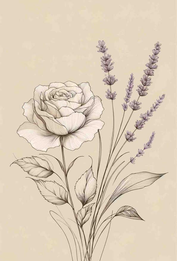
Elegant French Botanical Blossom
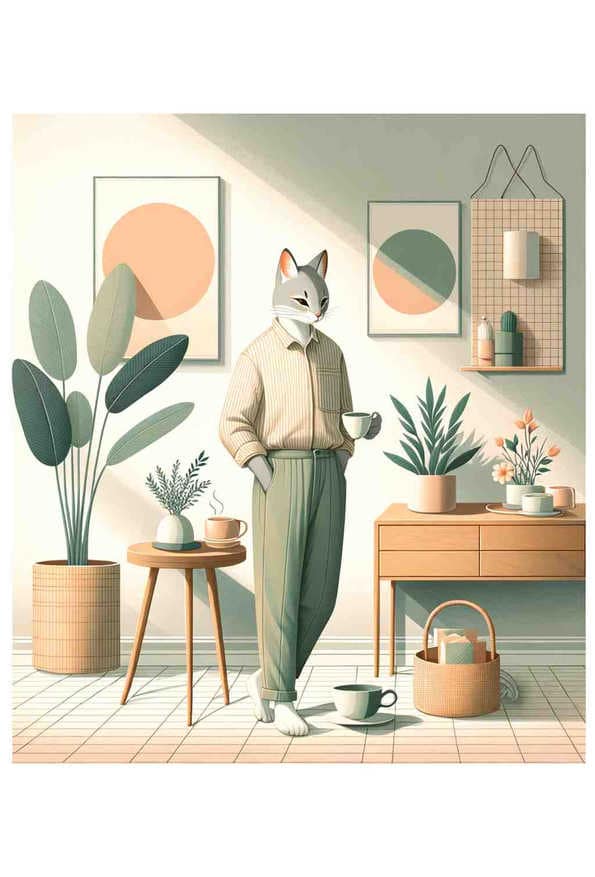
Chic Cats Tranquil Morning
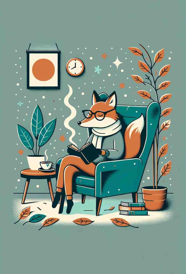
Whimsical Reading Fox
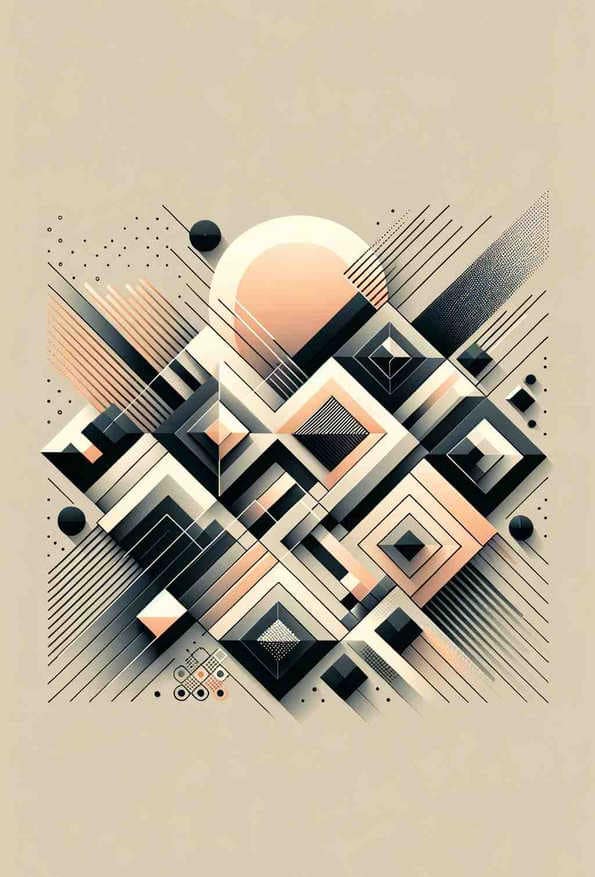
Monochrome Geometric Harmony
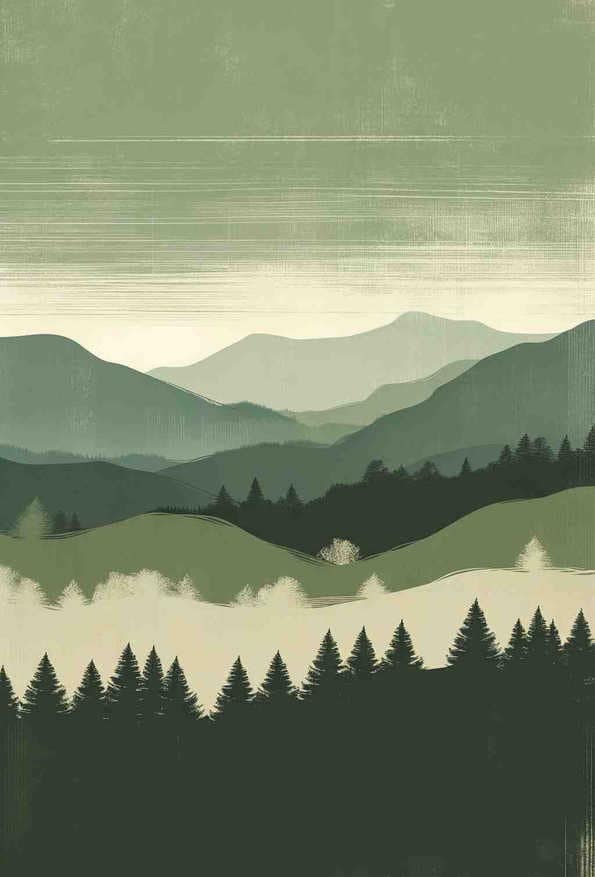
Serene Verdant Silhouettes
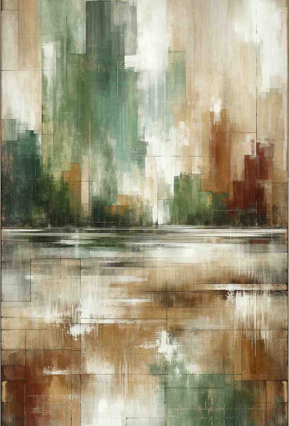
Rustic Serenity in Green and Midnight
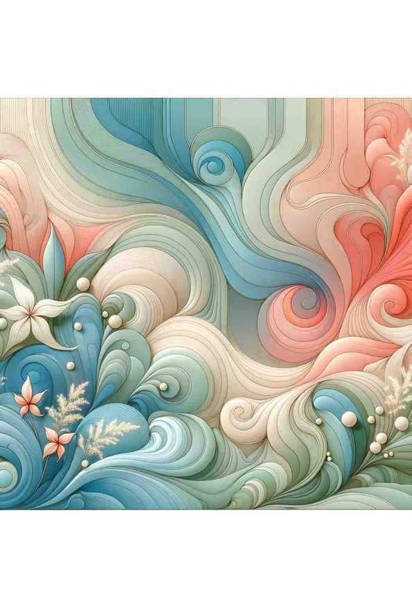
Pastel Serenity with Wild Blossoms
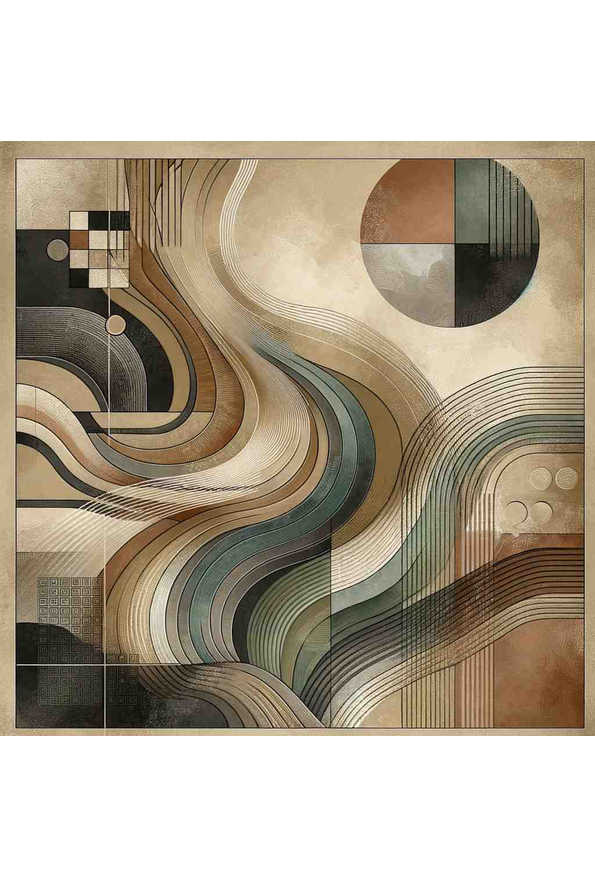
Earthy Harmony
Enchanted Aurora
Natures Harmony: Organic Forms in Abstract Art
Guide to Choosing Balanced Prints
Best Practices
- Use in transitional spaces
- Create symmetric arrangements
- Balance with room elements
Psychological Effects
- Does not compete with furniture, textiles or other artwork
- Tolerates a change of wall colour or furniture better than a statement piece
- Reads as considered rather than assertive
Scientific Background
There is no research finding that supports a "balanced" emotional response to an image, and this page does not claim one. The label is descriptive, not psychological: the classifier scores every print on arousal, pleasantness, warmth, contrast and measured visual density, and this collection holds the prints that sit in the middle of all of them. That is a statement about the artwork, which can be measured, rather than about the viewer, which in this case cannot.